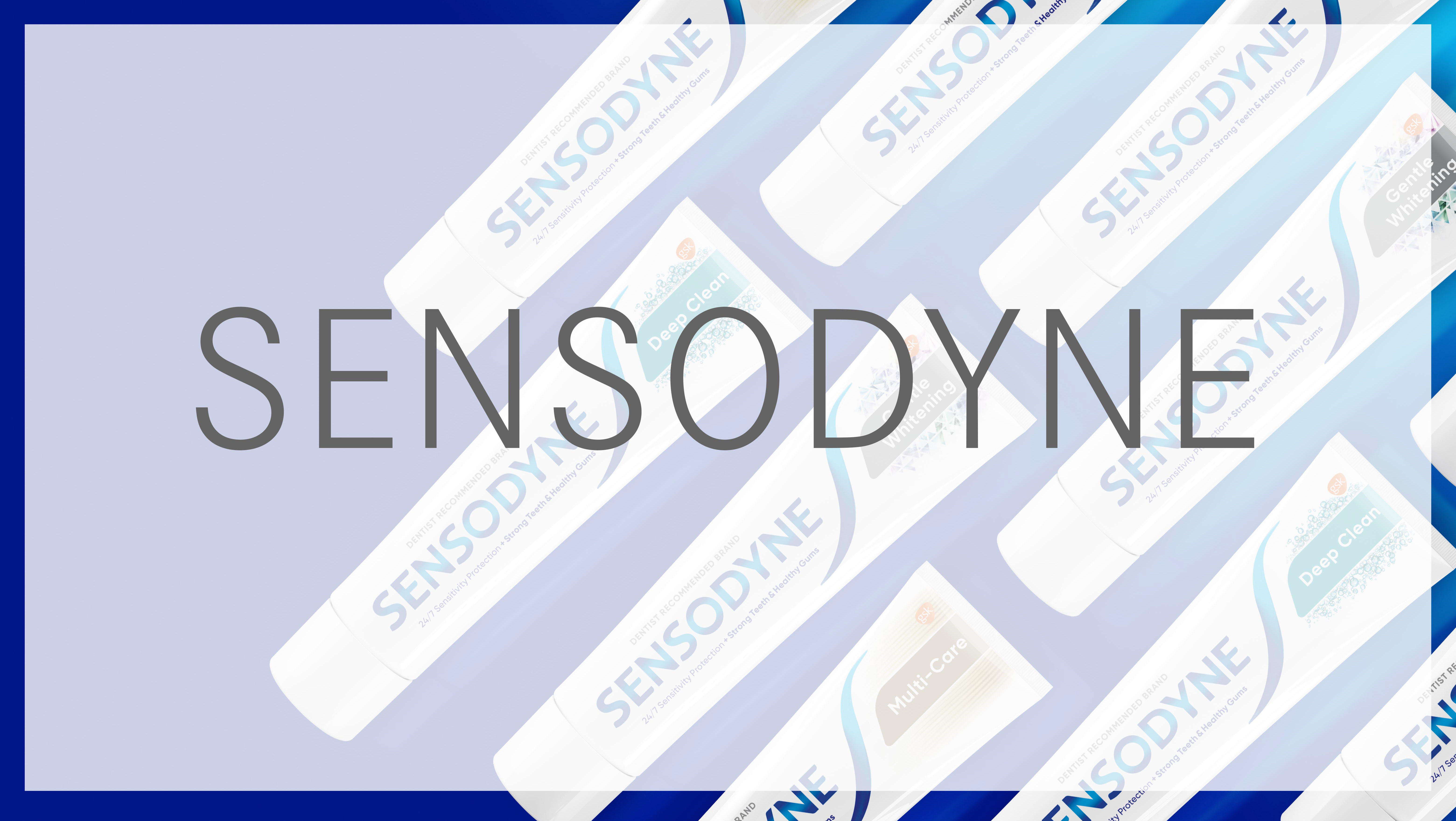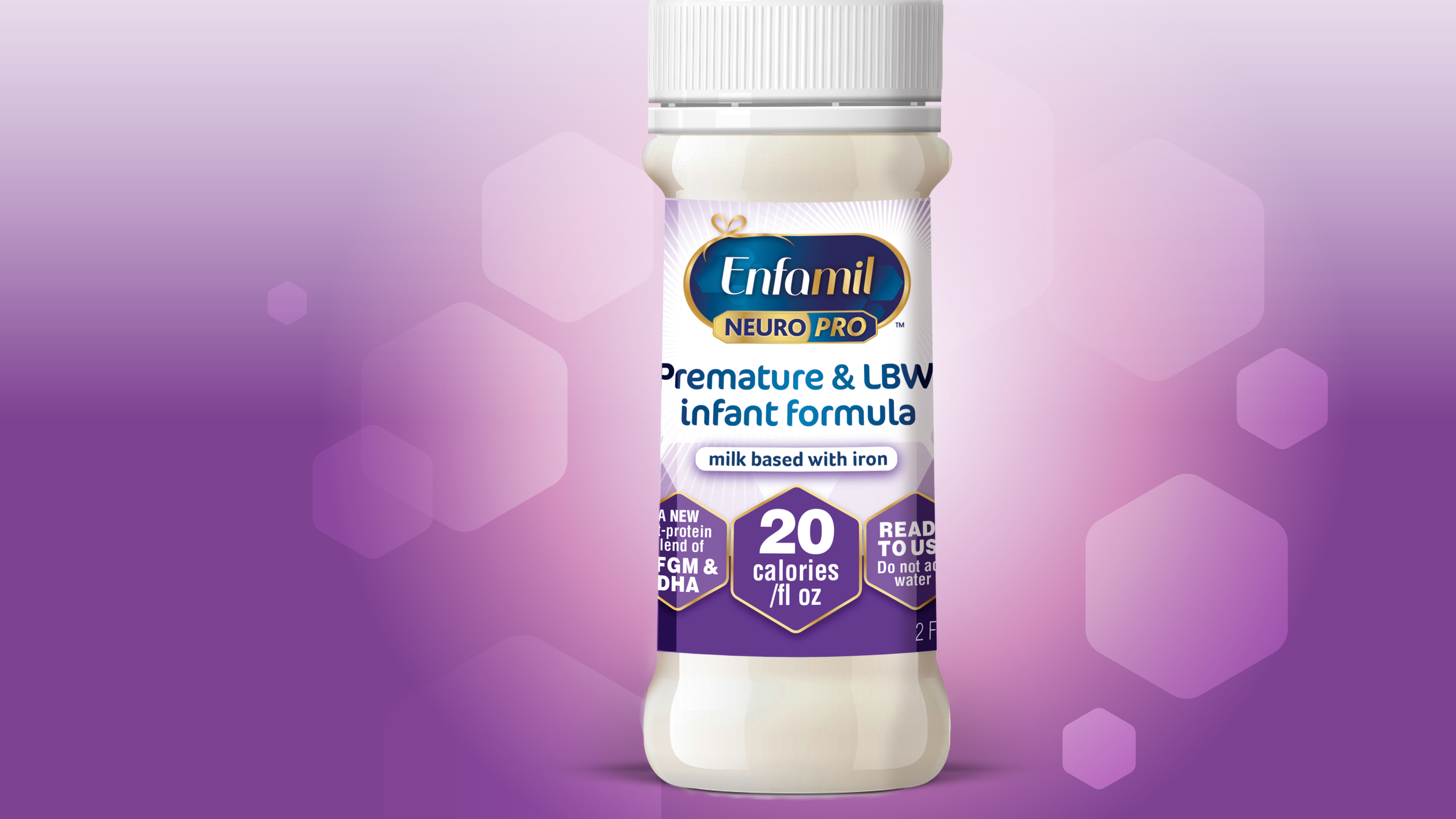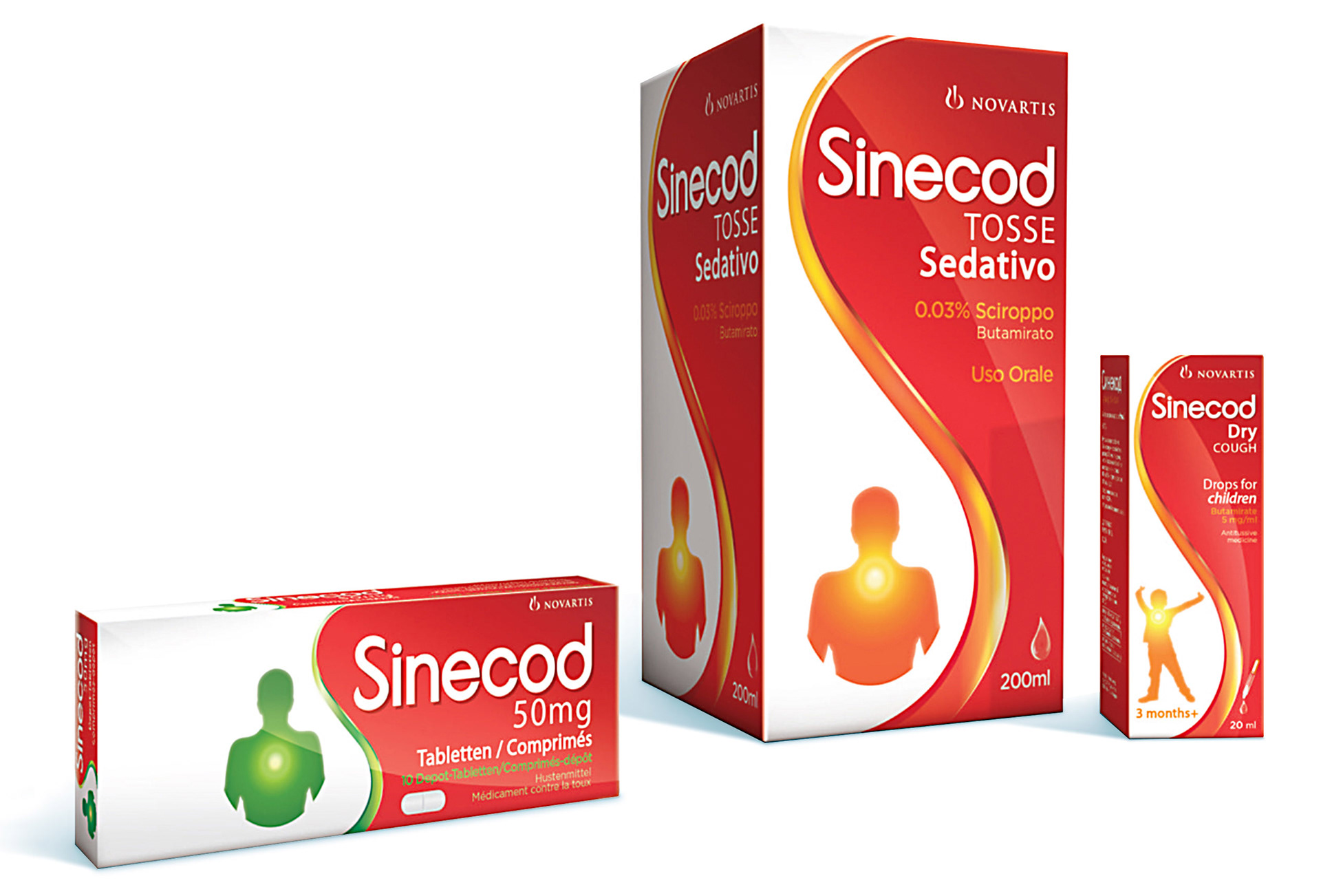


Soothing cough medicine Brand refresh of Cough medicine for Italy, Poland and Russian markets. Simpifying the overall colour palette, & building brand equity through use of red and white to clearly communicate pharma and medical cues. Developing an iconic ‘S’ shaped graphic which flows down the pack reflecting how the product works to soothe and target pain effectively. This shapes negative space creates a droplet to emphasis the power, potency and efficacy of the product in a soothing gentle way. Packaging design